Pages

Saturday, September 19, 2015

Will Chalkboard for Cheese

Up until now, I have not done any commercial chalkboards. All the ones I have done were for friends and family, and were done as favors or presents.

A few weeks ago, a friend of mine who was in the process of opening up a cheese store/cafe contacted me and wanted to know if I would do a chalkboard for her store. She had painted a huge wall with chalkboard paint, and was going to use it for her menu. I said yes, albeit with some fear and trepidation at the size and scale of the project. But after plenty of sketches, a few false starts, and determination/stubbornness, I finished the project. And here's the result!

I was contracted to do only the headings; my friend is planning to change her menu every couple of weeks, so the rest of the board is writing she will supply.


And here's some close-ups, after the rest of the board was filled out:


Since this was my first commercial project (but still for a good friend), I didn't know what to charge. So my friend paid me in cheese. Literally. And it was DELICIOUS!


Saturday, August 29, 2015

SOTMCL: Elvis

Welcome to another installment of "Stamps Only Their Mother Could Love" (SOTMCL, in the title above). Today's victim of the stamp world is actually the King of Rock and Roll: Elvis.


I'm already asleep, just looking at these stamps. Let me be the first to say that I love the overall design of this series of stamps from the USPS -- notice how the stamp sheet looks like a 45 record sleeve, complete with 45 record? But they picked the most boring, washed-out picture of Elvis they could possibly find, I think. It looks like his high-school yearbook picture or something.


The reverse of the stamp sheet is quite a bit better. Maybe this should have gone on the stamp instead?

This is actually the second commemorative stamp featuring Elvis. Here's the first:


That's a picture courtesy of Google -- I don't own this stamp. But it's a bright, lively stamp, and despite the slightly garish colors, it's a much more fitting tribute to its subject, I think.

Reckon the USPS got a little backlash over previous stamps in this series recently? Like Jimi? Or Janis?


I doubt it. I'm not sure the process works that way. But these stamps are ALIVE, they are miniature works of art that are perfectly fitting to their subjects, and I love them.

I'll use the Elvis stamps. Some of you may see him pop up in your mailbox in the not-too-distant future. But I warn you, he'll probably infect your mailbox with his Droopy Dog expression.

Monday, August 24, 2015

Stamps Only Their Mother Could Love

Greetings, long-suffering readers! (Both of you.)

A while back I mentioned off-handedly, in a letter to my good friend Limner, that I should start a series of blog posts on ugly stamps. We had been commiserating together about some of the ugly stamps that the USPS comes out with from time to time. Flannery O'Connor stamp, I'm looking at YOU:

I ask you, does this look like Flannery? It looks like some random woman with a peacock feather fetish. She needs her glasses!! And I don't like that look on her face either. She looks slightly constipated.

But after the little rant I had at the expense of stamps like this, I promptly forgot all about it. Well, do you know, Limner had the audacity to remind me of something I said I was going to do! Can you believe it! :-)

So here goes. The only change is, I'm not going to call this series by its original title: "Ugly Stamps I Have Hated." It sounds very harsh. Instead, it's going to be "Stamps Only Their Mother Could Love." Someone undoubtedly worked very hard on these stamps, and invested a lot of time and talent and energy into their production. I just don't like them, that's all.

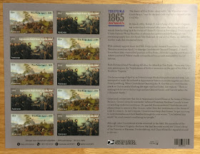
Flannery above doesn't count as the first entry because I do not own these stamps. They might be beautiful in person. No, the honor of the first ugly stamps are these (forgive the glare):


It's a set of two different stamps commemorating the end of the Civil War in 1865. One stamp depicts the Battle of Five Forks on April 1, 1865. The other depicts the surrender of the Confederate forces at Appomattox Court House on April 9, 1865.

You might wonder why these are my first choice of ugly stamps. The art is interesting. The historical interest is high, although I'm not a Civil War buff so it's kind of lost on me.

No, the ugliness comes from two things, I think:

  1. First off, these stamps are HUGE. They would dwarf even a business-size envelope. I don't know what it is with the movement towards larger and larger stamps, but I wish they would stop it. I send more reasonably-sized correspondence envelopes and can never use stamps this big. Especially if I happen to get creative with the address and mail art. Which I have been known to do.
  2. Secondly, the paintings are SO detailed that one literally can't appreciate them fully on a postage stamp (as gargantuan as these may be). I don't think stamps are the place for any kind of intricate artwork. It needs to be bold, highly visible, and relatively simple.
Also, there's the fact that these large stamps are part of an even larger commemorative sheet, which makes the whole thing just seem wasteful. Although Limner has recently taught me that it's OK to repurpose these parts of stamp sheets for envelope decorations -- I really must remember to try some of that soon.


Oh, and let's not even mention the colors in general. I know they are probably significant (blue and gray and all that) but they just make the whole thing come off as blah and uninteresting to the eye. I know a true stamp collector would probably have a quite different view of this sheet. But I look at it as a stamp user, not a stamp collector. And these are not terribly user-friendly stamps.

Here's one more picture so you can appreciate the true blah-ness of these stamps.


So there you have it! Two stamps that only their mother could love. What do you think? Am I being too harsh? Do you have votes for the next stamp in this series? Let me know in the comments!

Tuesday, August 4, 2015

Review of the Quo Vadis Textagenda Academic Planner

To start with, let me just say that I have not been a pen-and-paper calendar person for a very long time. I used to be, several years ago -- in fact all the way back to my high school days and even before -- and my calendar of choice was almost always an academic year calendar (since the academic year is the framework of my entire life). I liked paper calendars a lot. I looked forward to the time of year when I could buy the next year's calendar, and always went through all kinds of agonizing decisions about which one I would get. The ones I liked best could be customized and added to, to some extent, so that the calendar also became a kind of notebook (an extension of my brain, really).

Then the smartphone happened.

Well, to be honest, I should say the Palm Pilot happened first. But if you ever had one of those contraptions, you know that they could be downright clunky as far as getting information into and out of them. The smartphone was a vast improvement, of course, and soon I began seriously converting from a paper-based calendar to an electronic calendar. Google Calendar was my planner of choice -- the calendar I loved and hated simultaneously, through the years -- but I have tried nearly all the big names: iCal, Outlook, etc.

And yet, it never felt the same as the paper planners.

Part of it was not having everything in one place. Yes, I know syncing of all types of calendars is possible, but it never works quite the way you expect it to sometimes. Or else electrons get lost along the way. Or there’s a glitch involving weird time zone changes and such (Apple, I’m looking at YOU). And the thing is, although I have an Outlook calendar maintained through my employer, I don’t trust our IT folks enough to let them have control over my calendar. (The more astute of you might suggest at this point that my IT friends are infinitely more trustworthy than the folks at Google, but I’m really not so sure.)

So all these thoughts and others probably subconsciously led me to entering a Facebook contest recently, sponsored by the Quo Vadis notebook and planner folks. And I won! What I won was THIS, the Quo Vadis Textagenda Planner:


The planner without its band

I don’t think it was a coincidence that I won a paper planner. An academic year paper planner, no less. It was as if the Universe was saying, “Hey, Randall, come on and give this another chance.” So I did. And I have been thoroughly enjoying the experience -- so much so, that I don’t think I will be using my electronic calendars again anytime soon.


So why do I like this planner so much?
  1. The compact size is definitely a winner for me. If this is going to be going with me everywhere (and let’s face it, I need a calendar that can do that), it needs to be easily carried. At around 5 by 7 inches, this fits nicely in the hand. And it feels good too -- the cover is made out of a very attractive vinyl-ish plastic that’s very flexible and soft to the hand.
  2. The paper in a Quo Vadis notebook or planner is simply some of the best (betraying its Exaclair roots, of course!!). Thin and smooth, as always, but it also holds up well to almost any kind of ink you want to throw at it, including fountain pen ink. No bleedthrough, no feathering -- it’s absolutely no muss, no fuss. Check out these pictures of some testing I did, using three pens that write particularly “wet,” in my opinion:

The Pentel Energel 0.7 mm:

front
back

A Bic disposable fountain pen (medium point, basically):
front
back

A black Papermate Flair, medium point:
front
back

As you can see, all of these behaved flawlessly on the Quo Vadis paper, and while this is not any kind of exhaustive test, I would not be afraid to use any pen I wanted to in this book.


There’s another reason why I like this planner: it gives me choices. As you can see from the above picture of the page layout, there’s a small hourly agenda at the top of each page, just enough to put reminders or placeholder words to allow you to see your day’s agenda at a glance. But then the majority of the page is wide open for details about the day’s events, or notes, or anything else you want to write there. A “priority” section and a “notes” section, both highlighted in eye-catching colors, round out the landscape. I’ve been using the planner for a couple of weeks now, and I must say the layout is very effective and user-friendly.

If you are in the market for a new planner, or thinking about a return to paper planners from the world of electrons, give this one a try. You won’t be disappointed!

Disclaimer: I won this planner as a prize in a free giveaway sponsored by the Quo Vadis company. I was not required to write this review as part of the giveaway. All opinions expressed here are solely my own.

Saturday, June 6, 2015

An Embarrassing Confession

So call me clueless, but when did the postal rate for postcards go up? I missed it, I think. Or maybe it's a function of the fact that we use Forever stamps for first-class letters, and so I don't notice when that rate goes up. Anyway, I am here to tell you (in case you have been under this rock here with me) that the current rate for a normal-sized postcard (you gotta be careful there too!!) is 35 cents.

And I apologize if I have sent any of you postage-due postcards -- although I have long suspected that my mail lady is my postal guardian angel. Since I do send and receive quite a bit of mail, I think she must go behind me and correct my postage when I do boneheaded things like send a postcard with 34 cents of postage on it. Or maybe you all are too polite to tell me I am an idiot. :-)

Anyway, the point of all this is to sing the praises of the USPS, because they have finally seen the light and issued some really great Forever postcard stamps. Check them out! I love them, and just ordered some. (My local post office might have some of these, but I am way too lazy for that.)


Now I don't have to worry about how much postage to put on a postcard! Cue the singers...

Saturday, May 9, 2015

Always with the envelopes, huh?

I had a couple of birthday cards to send yesterday, so of course they cannot be addressed normally -- it's time for some fun with lettering!


Some days I would rather do this than just about anything. But it doesn't pay very well. (ha!)

In case you are curious, these were done with Micron pens. Keeping it simple.

Saturday, April 18, 2015

Lettering on painted paper

This is an experiment I did this afternoon. One of my favorite things to do is to paint papers that might otherwise be thrown into the landfill and then do creative things with them, such as lettering on them. This is a bulletin insert from church, necessary because our old hymnal did not have "Rock of Ages" in it. What a travesty, you may say -- although I actually don't like this hymn. It can get slow and mournful and is just not uplifting to me personally. (If this is YOUR favorite hymn, then you'll be happy to know our new hymnal does have it -- so the error was corrected!)

So -- I painted on this paper some while back with some ordinary acrylic paint, and then set it aside for some time.


It caught my eye today, and I wanted to letter something on it. The "music" was done with a black Flair pen, and the rest of it was done with a black Sharpie. I found it interesting that neither one of these pens played particularly nice with the paint. I wonder if there's some kind of chemical reaction? I know Sharpies contain alcohol-based ink. Not sure about Flairs, but I would suspect they have the same. Anyway, this is not great art -- I was just fooling around, after all -- but I thought it turned out kind of interesting, so here it is!

Saturday, April 11, 2015

Restocking the stash

Recently I have been sticking my toe.... or maybe pen.... back into the writing by hand waters. I started slow, with some mail to some long-neglected pen friends, who, although I was not writing to them, were ALWAYS ON MY MIND.


OK, well maybe not like that.....

Anyway, another toe-dipping venture is Postcrossing, and if you are not familiar with this website, you need to be. So I have been sending out postcards, and my "local color" cards have been running low. I do not live in a tourist mecca, by any stretch of the imagination, so getting postcards here is difficult. Whenever I make a short jaunt out of town, to the coast or New Orleans, I like to look around for postcards to stock my stash.

Today I went to the Mississippi Gulf Coast for a Saturday outing, and wandered all over -- Bay St. Louis, Pass Christian, Waveland, Gulfport, and Biloxi. Much of the wandering was done on Highway 90, which travels right along the beach for miles and miles. It's not the prettiest beach of course, because 1) it's entirely manmade (although it is supposedly the longest manmade beach in the entire world); and 2) it doesn't access the Gulf of Mexico directly -- the beaches in Gulfport and Biloxi face the Mississippi Sound -- so this means our beaches don't get what they call "ocean dynamics." I think this translates into: we don't get nice waves and the beaches can get kind of trashy with debris. BUT! It's a BEACH. I love to look at the water.

Satellite view of the sound, with the Mississippi barrier islands

A view of the beach/hotels/casinos

Long story long -- when I am on the beach I generally like to hit one of the souvenir shops there. There are not that many down there, but they are pretty sizeable. And there's one -- Sharkheads -- that has lots and lots of postcards. I came home with a few:

OK, this is more than a few -- it's a pile of 72 cards, to be exact.

I think I am stocked up now and ready for some more Postcrossing. If you want one of these, leave a comment and I'll send you one too!